30 October, 2023
Hello and welcome to this week’s JMP Report
On the equity front we saw 4 stocks trade on the local market. BSP traded 17,236 shares, closing 1t higher to close at K13.51, KSL traded 127,452 (note no PNGX Report for Tuesday), closing 10t lower at K2.41, STO traded 102, closing 1t higher at K19.23 and CCP traded 33,989, closing 3t higher at K2.08.
WEEKLY MARKET REPORT | 23 October, 2023 – 27 October, 2023
| STOCK | QUANTITY | CLOSING PRICE | CHANGE | % CHANGE | 2022 FINAL DIV | 2023 INTERIM | YIELD % | EX-DATE | RECORD DATE | PAYMENT DATE | DRP | MARKET CAP |
| BSP | 17,236 | 13.51 | 0.01 | 0.07 | K1.4000 | K0.370 | 13.33 | FRI 22 SEPT 2023 | MON 25 SEPT 2023 | FRI 13 OCT 2023 | NO | 5,317,971,001 |
| KSL | 127,452 | 2.41 | -0.09 | -3.73 | K0.1610 | K0.097 | 10.75 | WED 6 SEPT 2023 | THU 7 SEPT 2023 | THU 5 OCT 2023 | NO | 64,817,259 |
| STO | 102 | 19.23 | 0.01 | 0.05 | K0.5310 | K0.314 | 4.42 | MON 28 AUG 2023 | TUE 29 AUG 2023 | THU 28 SEPT 2023 | – | – |
| KAM | 0 | 0.90 | – | 0.00 | – | K0.12 | 13.33 | TUE 19 SEP 2023 | WED 20 SEP 2023 | THU 19 SEP 2023 | YES | 49,891,306 |
| NCM | 0 | 75.00 | – | 0.00 | USD$1.23 | K0.719 | 2.60 | FRI 18 AUG 2023 | MON 21 AUG 2023 | MON 18 SEPT 2023 | – | 33,774,150 |
| NGP | 0 | 0.69 | – | 0.00 | – | K0.0.3 | 5.80 | FRI 6 OCT 2023 | WED 11 OCT 2023 | WED 1 NOV 2023 | – | 32,123,490 |
| CCP | 33,989 | 2.08 | 0.03 | 1.44 | K0.123 | K0.110 | 11.51 | FRI 24 MAR 2023 | WED 29 MAR 2023 | FRI 5 MAY 2023 | YES | 569,672,964 |
| CPL | 0 | 0.70 | – | 0.00 | – | – |
– |
WED 22 MAR 2023 | THU 30 MAR 2023 | THU 30 JUL 2023 | – | 195,964,015 |
On the PNGX, Newmont issued their “quotation disclosures” – listed below for your information;
- NEM: Access to Newmont Announcements in last 2 years – PNGX Markets – PNG’s National Stock Exchange
- NEM: Newmont Q2 2023 Quarterly Report – PNGX Markets – PNG’s National Stock Exchange
- NEM: Newmont Q1 2023 Quarterly Report – PNGX Markets – PNG’s National Stock Exchange
- NEM: Newmont 2022 Annual Report – PNGX Markets – PNG’s National Stock Exchange
- NEM: Newmont By Laws – PNGX Markets – PNG’s National Stock Exchange
- NEM: Procedure 1.7.1. Checklist – PNGX Markets – PNG’s National Stock Exchange
- NEM: Newmont Appendix 1C – PNGX Markets – PNG’s National Stock Exchange
Dual Listed PNGX/ASX Stocks
BFL – 5.07 -13c
KSL – 76c -.05c
NCM – 23.35 -$1.46
STO – 7.83 -17c
The JMP Order Book
This week we are nett buyers of BSP, KSL and STO
Other assets we watch
Natural Gas – 3.44 +54c
Platinum – 912 +9c
Bitcoin – 34,583 +16%
Ethereum – 1,798 +9.75
PAX Gold – 1,987 +1.03%
On the Interest rate front
In the very short end, the Bank PNG took 1.6 bn excess liquidity from the market @ a set rate of 2%. This remains in line with the current Monetary Policy stance. In the 364 day TBill, the Bank accepted 278million in bids @ 3.31%, leaving the market oversubscribed a total of 51m across 182, 273, and 364 day maturities.
The 2023 GIS issuance program has been completed in line with the 2023 Budget numbers, but don’t be surprised if we see more stock on offer.
What we’ve been reading this week
Five constraints on medium term investment returns
Dr Shane Oliver – Head of Investment Strategy and Economics and Chief Economist, AMP Investments
Key points
– Five megatrends suggest higher medium term inflation pressures & lower economic growth than pre-pandemic.
– These are: a move away from economic rationalist policies; the reversal of globalisation; rising geopolitical tensions; climate change and decarbonisation; as well as slowing and aging populations. A productivity boost from artificial intelligence should provide some partial offset though.
– But taken together this will likely constrain medium term superannuation returns, potentially to around 5.5% pa.
Introduction
Starting in the early 1980s investment returns were spectacularly strong. Sure there were bumps along the way like the 1987 share crash, but Australian balanced growth superannuation funds returned an average 14.1% pa in nominal terms and 9.4% pa in real terms (i.e. after inflation) between 1982 and 1999. And that was after taxes and fees. This was well above what would normally be expected from such funds.
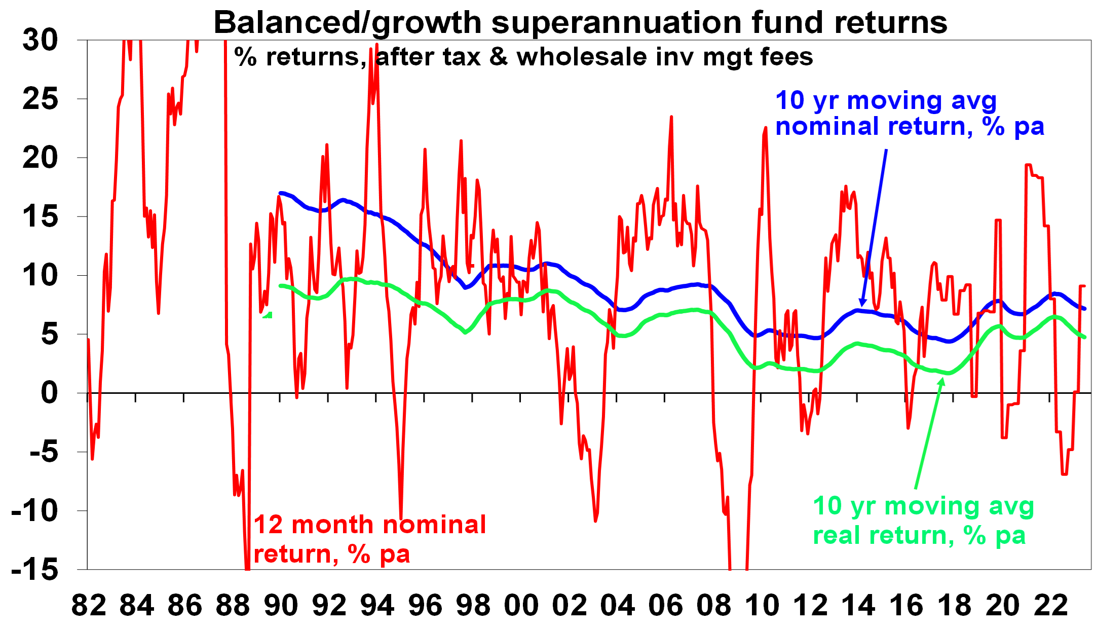
Source: Mercer Investment Consulting, Morningstar, AMP
Since 2000 nominal super returns have been more constrained averaging 6.2% pa as we entered a lower return world with real returns averaging 3.6% pa. Mind you this is still pretty good considering that 1 year bank term deposit rates averaged just 3.7% pa and only 1.1% pa after inflation and that was before taxes. The odds are that returns are likely to be even more constrained over the next 5 to 10 years. This note looks at why.
What drove the strong returns from the early 1980s?
There was an element of mean reversion (or payback) after the poor returns of the high inflation 1970s. But fundamental drivers were:
- Economic rationalist policies – deregulation, privatisation, competition reforms, tax reform and free trade – as policy makers focussed on supply side reforms in reaction to the inflation of the 1970s.
- Globalisation which boosted trade & competition and lowered costs.
- Easing geopolitical tensions with the ending of the Cold War in 1989 which led to the peace dividend of reduced defence spending.
- Corporate focus on return on capital.
- Positive demographics as baby boomers entered peak consumption and peak productivity.
- Inflation targeting by independent central banks with a focus on keeping inflation and inflation expectations at low levels.
- And, of course, the tech boom of the 1990s.
Taken together this drove low inflation and strong productivity growth which underpinned a secular bull market in shares – which are the biggest exposure in balanced growth super funds – through the 1980s and 1990s. See the next chart. It paused in the US in 2000-2013 but then took off in Australia with the 2000s resources boom only to take off in the US again from 2013 helped by ever lower interest rates into the pandemic (which pushed up the value of shares and other growth assets). Meanwhile bond returns were high given their high starting point yields in the early 1980s.
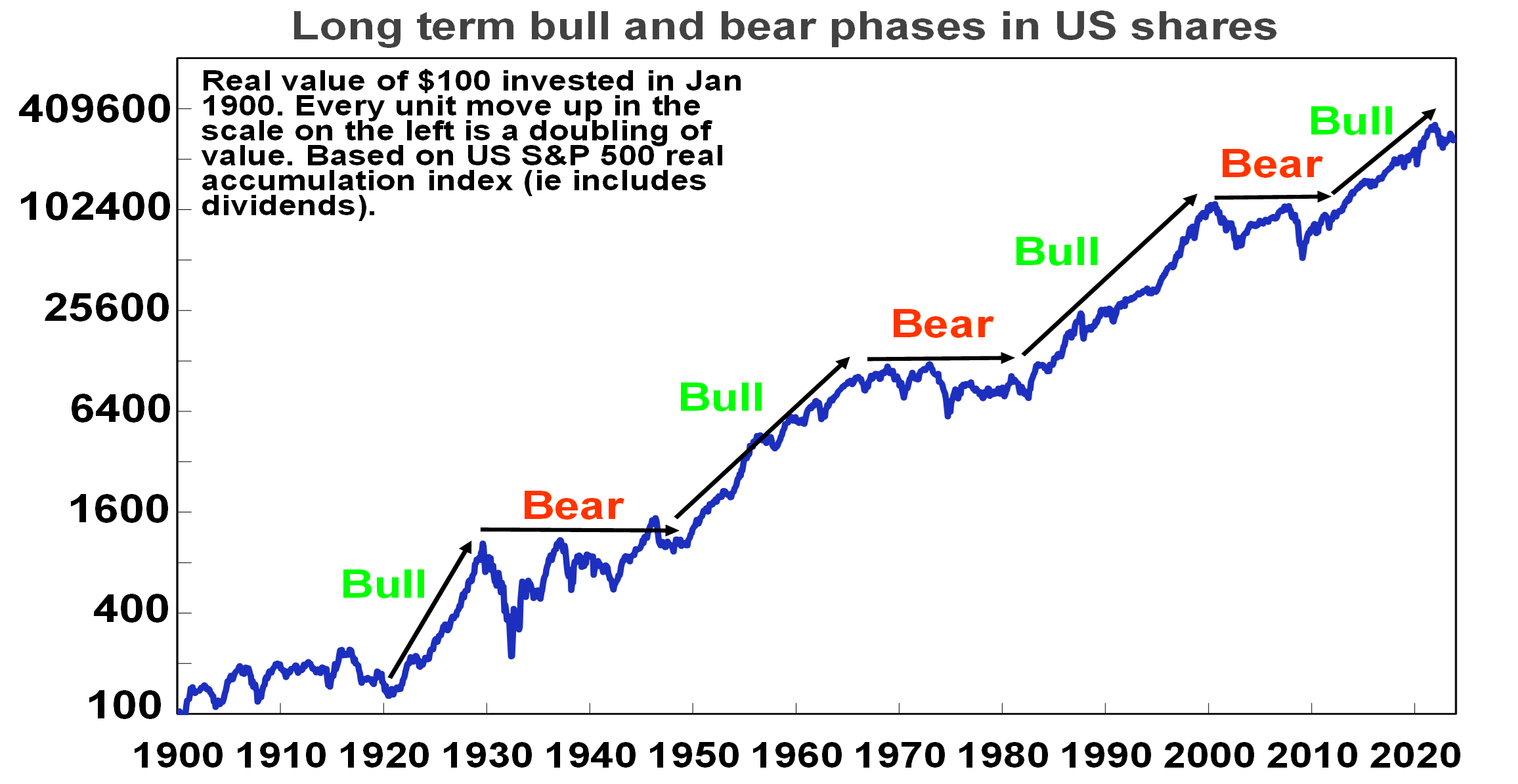
Since 1900 there have been four major secular bull markets in US shares: the 1920s (with electricity; chemicals & mass production); the 1950s and 60s (with petro chemicals, electronics & aviation); the 1980s and 90s (see the text); and since 2013. Source: Bloomberg, R Shiller, AMP
Megatrends – five key constraints on returns
Unfortunately, the drivers of strong returns from the 1980s are reversing. There are five megatrends of relevance (see here for more detail).
- Bigger government, less economic rationalist policies
As a result of the problems highlighted by the GFC, rising inequality, stagnant real wages, aging populations, climate change, the success of government income support in the pandemic, the rise of populism and a collective memory loss regarding the lessons of the past there is a backlash against economic rationalist policies and more support for big government. It’s evident in Australia, with the rising share government spending, widespread support for higher taxes and labour market reregulation. The risk is lower productivity & higher inflationary pressure.
- The reversal of globalisation
The post-WW2 period saw a huge surge in global trade and financial links between countries as more countries entered the global trading system and trade barriers collapsed. This saw production allocated globally according to comparative advantage and highly integrated global supply chains. The cost reductions and competition helped reduce inflation. But the trend towards freer trade stalled in the 2000s and trade barriers are on the rise. The pandemic, rising geopolitical tensions and rising nationalism are accelerating this. Support for free trade policies has faded in favour of friendshoring, onshoring and old-fashioned protectionism to support manufacturing locally, eg, with subsidies for battery projects and electric vehicles. Inevitably this will lead to higher costs.
- Increasing geopolitical tensions – a new cold war
Declining military spending into the 2000s was disinflationary. This was facilitated by the move to a “unipolar” world dominated by the US and increasing believe in free market liberalism. This started to fracture after the GFC and we are now in a “multipolar” less stable world with arguably a new Cold War between China, Russia and Iran on the one hand and Western countries on the other. The war in Ukraine and now Israel are arguably signs of this. This adds to the threat to free trade but also risks increased military spending. This means more demand for metals and more government spending which will add to inflationary pressure.
- Climate change and decarbonisation
Ultimately the shift to sustainable energy could result in lower costs. But we are a long way from that and climate change and the move to net zero will add to costs and inflation via: extreme weather events; associated rebuilding and higher insurance premiums; costs of mitigation; increased metals demand as economies retool; and increased pollution regulation.
- Less workers, more consumers
Global population growth is slowing, while in advanced countries and China the working age population is declining. And populations are aging, resulting in a rise in the ratio of children and older people to working aged people. Thanks to its high immigration program Australia is in a somewhat better position. But globally, the upshot is less workers (supply) and more consumers (demand) which will add to inflationary pressures.
Implications for growth and inflation
Taken together these key megatrends risk lowering productivity growth making economies more inflation prone. There is some offset with technological innovation – with artificial intelligence offering significant potential to boost services sector productivity, although this will take time to materialise. But the more inflation prone environment means central banks will have to work harder to keep inflation down, which will require higher and more variable interest rates than we saw pre-pandemic.
The collapse in inflation from the 1980s provided a tailwind for super returns because the fall in interest rates and economic uncertainty allowed growth assets to trade on lower investment yields and higher price to earnings multiples (which boosted capital growth). A more inflation prone world will remove this tailwind and threaten its reversal with cash and fixed interest becoming relatively more attractive, price to earnings ratios on shares settling at lower levels and income yields on real assets at higher levels (which will constrain capital growth).
What does all this mean for medium term returns?
Our approach to get a handle on medium-term (i.e. 5-10 year) return potential of major asset classes is as follows:
- For bonds, the best predictor of future medium-term returns is current yields. The rise in yields has increased their return potential.
- For equities, current dividend yields plus trend nominal GDP growth does a good job of predicting medium-term returns.
- For property, we use current rental yields and likely trend inflation as a proxy for income and capital growth. The surge in online spending and “work from home” means significant downside risks to returns.
- In the case of cash, we use our forecast cash rate over medium term.
Our latest return projections are shown in the next table. The second column shows each asset’s current income yield, the third shows their 5–10 year growth potential, and the final column shows their total return potential. Note that: we assume inflation averages around 2.5% pa; and we have cautious real economic growth assumptions reflecting the five megatrends noted above. This will likely constrain capital growth.
Producted medium term returns, % pa
|
|
Current Yield # |
+ Growth |
= Return |
|
World equities |
1.9^ |
4.7 |
6.6 |
|
Emerging equities |
2.2^ |
7.3 |
9.4 |
|
Australian equities |
4.3 (5.6*) |
3.7 |
8.0 (9.3*) |
|
Unlisted commercial property |
4.6 |
2.5 |
7.1 |
|
Australian REITS |
5.0 |
2.5 |
7.5 |
|
Global REITS |
4.0^ |
2.5 |
6.4 |
|
Unlisted infrastructure |
3.9*^ |
3.0 |
6.9 |
|
Australian bonds (fixed interest) |
4.5 |
0.0 |
4.5 |
|
Australian cash |
3.0 |
0.0 |
3.0 |
|
Diversified Growth mix |
|
|
6.7 |
|
Diversified Grth mix* ex fees & tax |
|
|
5.5 |
All returns are pre fees & taxes except the final row. # Current dividend yield for shares, net rental yields for property & duration matched bond yield for bonds. ^ Includes forward points. * With franking credits added in. Source: AMP
Key observations
- After falling for many years due to the fall in starting point yields for major assets the medium-term return potential using this approach has improved to around 6.7% over the last 15 months (see next chart) due to now higher starting point interest rates and bond yields and somewhat higher starting point yields on shares (which remain down in value from record highs) and commercial property.
- After allowing for taxes and fees this still implies pretty constrained nominal medium term returns for balanced growth super funds based on a traditional mix of assets of 5.5% pa which is a bit below the average since 2000. This is still better than bank term deposit rates which average up to 4.5% before taxes, and makes no allowance for any value added from active investment management.
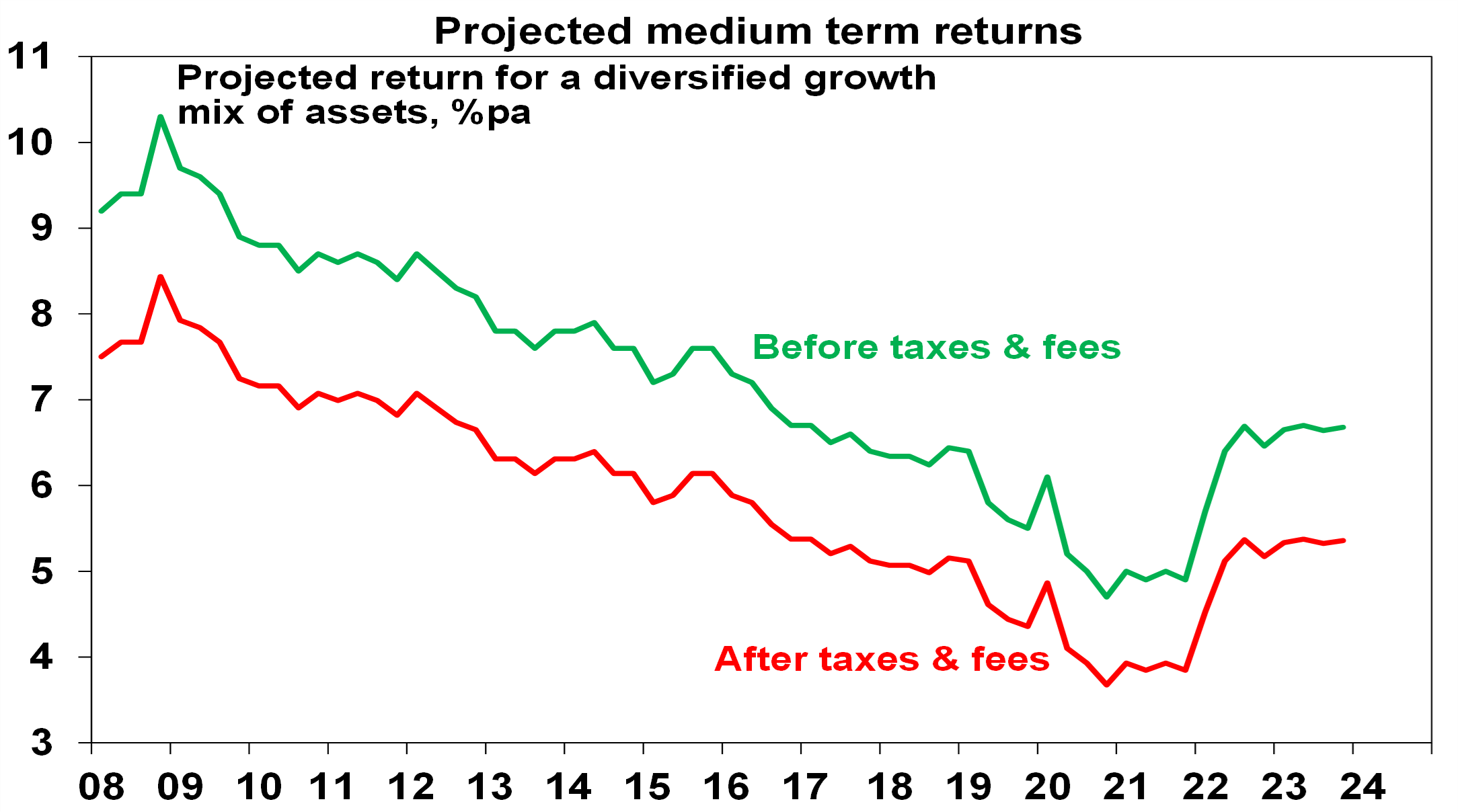
Source: AMP
- The main downside risk is that inflation trends higher driving a further trend rise in interest rates, bond yields and yields on shares, property & infrastructure resulting in an ongoing drag on capital growth.
Implications for investors
- First, have reasonable return expectations. In the past super returns were boosted by very favourable conditions which have now faded.
- Second, remember there is no free lunch – investment opportunities offering higher returns likely entail much higher risk.
- Third, medium term returns from super are still likely to be well above bank term deposit rates on an after tax and fees basis.
- Finally, while bear markets are painful, they push up the medium-term return potential of shares and so provide opportunities.
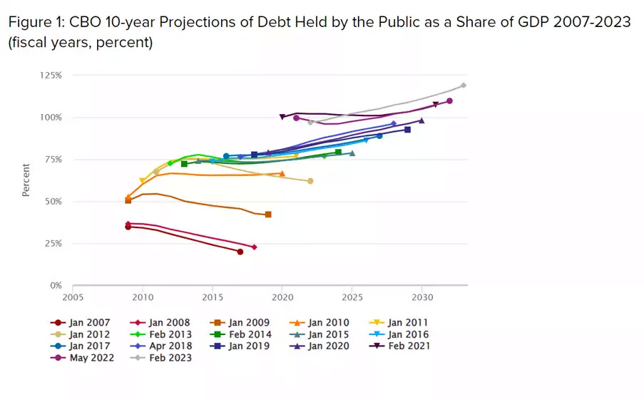
How Unsustainable is US Government Debt – Penn Wharton Budget Model
The IMF has recently come out to claim US deficits are unsustainable labelling the US debt ‘the most worrying’ among countries globally… and when the World Reserve Currency is the most worrying in the world – people start paying attention… Many commentators have recently started to sound alarm bells in regard to US debt – and today we will do the same and look into some of the modelling that is used to look at the sustainability and how even these are floored.
Penn Wharton Budget Model
The Penn Wharton Budget Model is used by governments and credit ratings to determine the forward looking deficits and their impact on government debt models. You often hear 2050 as the drop dead date where the US debt held by the public reaches 200% which has been identified as the ‘unsustainable level’. Today we look at why that number is filled with optimism especially under the current US political landscape and why the end will come sooner without immediate action from the US Congress to tame in their out of control fiscal spending. Interestingly for the last month adding on average of $20 billion a day or $600 billion. We posted a great looking into this yesterday too.
Penn Wharton Budget Model – Assumptions and Conclusions
What is it and what are some of the assumptions that they have made to estimate 2050 as the drop dead US budget default date? In a recent special issue from Penn Wharton When Does Federal Debt Reach Unsustainable Levels? — Penn Wharton Budget Model (upenn.edu) they concluded the following:
Summary: PWBM estimates that—even under myopic expectations—financial markets cannot sustain more than the next 20 years of accumulated deficits projected under current U.S. fiscal policy. Forward-looking financial markets are, therefore, effectively betting that future fiscal policy will provide substantial corrective measures ahead of time. If financial markets started to believe otherwise, debt dynamics would “unravel” and become unsustainable much sooner.
The paper also identified the increased tax burden from wars and an aging population that have not been accounted for in the modelling stating:
‘The US is neither at war nor in a recession. Nonetheless, it is running a budget deficit of 7 per cent of GDP with deficits projected to reach 10 per cent of GDP by 2030 and to increase from there as Medicare and social security programs put a greater burden on the nation’s finances. If more spending on defence and decarbonisation is needed, then the outlook will grow even more grim. US government debt is now around US$33 trillion.’
These assumptions therefore assume the following which are arguably assumptions that shouldn’t have been made:
- There will be years of budget surpluses (something that has not been achieved since 2001, and even that relied on some clever accounting…) and it also assumes that
- There will be no ‘risk premium’ applied to US debt (something that we are starting to see occur quickly now with the reinverting of the yield curve)
What’s $600 billion a month?
Just extrapolating out the current US spend of $600 billion per month with US tax receipts optimistically staying at current rates of approximately $4.5 trillion per annum. With $600 billion per month, the US deficit which is currently claimed at $2 trillion per annum is underdone by close to $700 billion, and this is without taking into account new debt and reissued debt being couponed at 5%. The deficit is likely closer to $1 trillion more than estimates. So if the Penn Wharton model is taking the government at their fiscal word – they are once again underestimating the 10 year modelling, which hasn’t gotten it right since its inception in 2007
So, with current US GDP at $23.3 trillion and current publicly held debt at $26.3 trillion, an additional $1 trillion per annum sees us reach the debt default level much sooner. On basic numbers the estimated equivalent would be 138% verse 166% of GDP by 2030.
|
|
GDP @ 4% |
$2 trillion@ 4% |
$3 trillion@ 4% |
$2 trillion deficit %GDP |
$3 trillion deficit %GDP |
|
2023 |
22.30 |
26.3 |
27.3 |
118% |
122% |
|
2024 |
23.19 |
28.34 |
30.34 |
122% |
131% |
|
2025 |
24.12 |
30.38 |
33.38 |
126% |
138% |
|
2026 |
25.08 |
32.42 |
36.42 |
129% |
145% |
|
2027 |
26.09 |
34.46 |
39.46 |
132% |
151% |
|
2028 |
27.13 |
36.5 |
42.5 |
135% |
157% |
|
2029 |
28.22 |
38.54 |
45.54 |
137% |
161% |
|
2030 |
29.35 |
40.58 |
48.58 |
138% |
166% |
*$2 vs $3 trillion US deficit debt as % of GDP
Interestingly if we throw the $6.8 trillion Quantitative Tightening into the equation, with $6.8 trillion that is currently held by the Federal Reserve and assuming a $1 trillion run off per year with a $3 trillion deficit – the deficit would hit close to 189% by 2030…
|
GDP@4% |
$2 trillion @4% |
$3 trillion @4% |
$2 trillion deficit %GDP |
$3 trillion deficit %GDP |
|
|
2023 |
22.30 |
26.3 |
27.3 |
118% |
122% |
|
2024 |
23.19 |
29.34 |
31.34 |
127% |
135% |
|
2025 |
24.12 |
32.38 |
35.38 |
134% |
147% |
|
2026 |
25.08 |
35.42 |
39.42 |
141% |
157% |
|
2027 |
26.09 |
38.46 |
43.46 |
147% |
167% |
|
2028 |
27.13 |
41.5 |
47.5 |
153% |
175% |
|
2029 |
28.22 |
45.34 |
51.54 |
161% |
183% |
|
2030 |
29.35 |
48.38 |
55.38 |
165% |
189% |
Falling Tax Revenue
We recently discussed the US jobs report with government jobs outpacing public jobs by 2 to 1, remembering the tax revenue from the public jobs supports the government jobs via US government spending, so at a tax rate of 25% private jobs need to outpace public jobs by a minimum 4 to 1 to justify these public jobs. Anything less will ultimately lead to an outpacing of national debt to GDP.
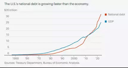
With national debt growing faster than GDP since 2010, and more recently increasing at a faster rate, the US is also facing a shrinking tax revenue base, with a rolling average 8.4% fall.
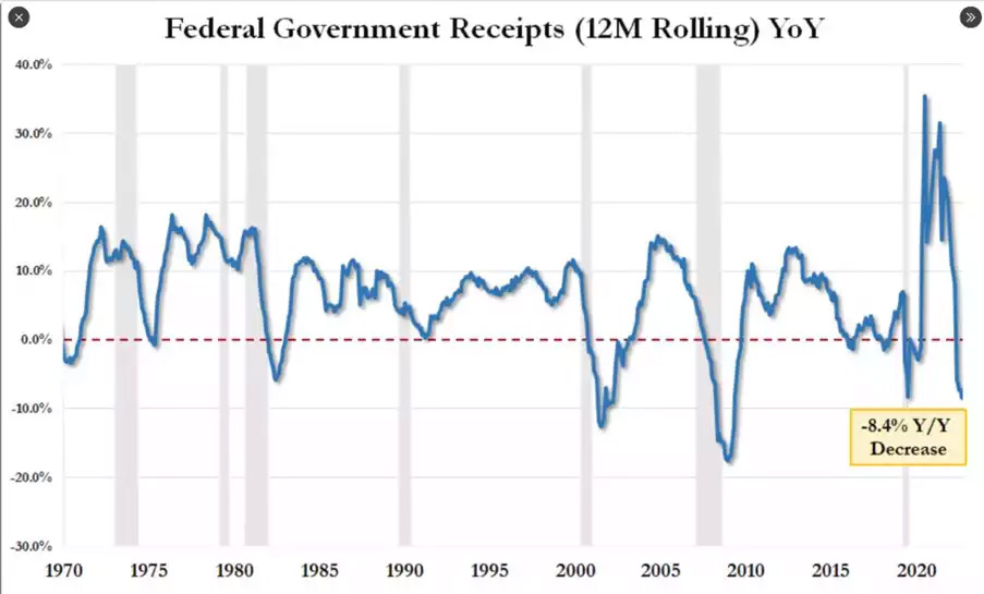
Assuming the tax revenue continues to fall without moderating deficits – the default level could even occur in this decade!
|
|
GDP @ 4% |
Revenue fall 8% |
Expenditure @4% |
Deficits @ 2 trillion |
Reduced tax revenue $2 trillion %GDP debt |
Reduced tax revenue $3 trillion %GDP debt |
|
2023 |
22.30 |
4.50 |
6.50 |
2.00 |
118% |
131% |
|
2024 |
23.19 |
4.14 |
6.76 |
2.62 |
125% |
140% |
|
2025 |
24.12 |
3.81 |
7.03 |
3.22 |
133% |
151% |
|
2026 |
25.08 |
3.50 |
7.31 |
3.81 |
143% |
162% |
|
2027 |
26.09 |
3.22 |
7.60 |
4.38 |
155% |
175% |
|
2028 |
27.13 |
2.97 |
7.91 |
4.94 |
167% |
189% |
|
2029 |
28.22 |
2.73 |
8.22 |
5.50 |
180% |
203% |
|
2030 |
29.35 |
2.51 |
8.55 |
6.04 |
194% |
218% |
- Reduced tax revenue and impact on % GDP to debt
Yield Curve Reinverting
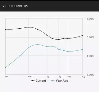
The alarm bells are ringing, the yield curve is reinverting and quickly with the holders and buyers of US debt clearly not believing the 2050 year that is currently being sold to the world. 1 month rates have increased 2% and all other bond periods have either breached 5% or will do so in the next couple of weeks.
*yield curve rates current vs 12 months ago
The end will come sooner and all depends on the US becoming more prudent, more responsible and non- divisive which with the current inability to even elect a Speaker seems unlikely in the short term. The yield curve has recently started reinverting – a warning we gave previously – as US government risk is priced in. So, watch this space carefully as we will warn you again the risk has been priced in for 2050 and, with models using unrealistic assumptions and governments continue their fiscal party, 200% is likely to be reached a lot earlier and therefore the risk premium is simply not enough. There is a very good reason bonds are selling off and gold is surging…
Gold Now Beating Stock Market in 2023
Posted 27/10/2023
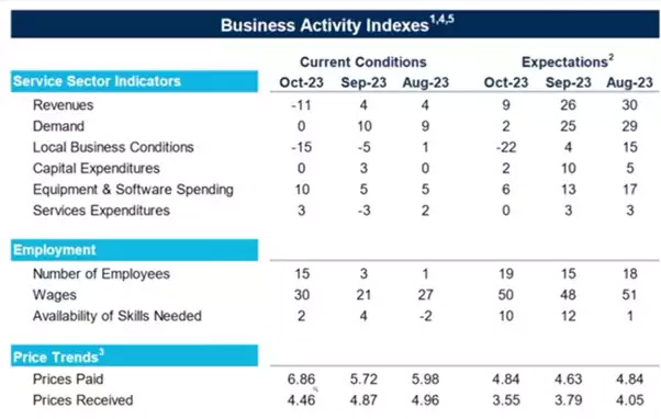
Service Sector Falling Apart
According to a survey by the Richmond Fed, October saw the revenues index drop by -11 and the demand index fall similarly from 10 to 0. The indices for future revenue expectations in the service sector also suffered. The local business conditions index fell from -5 last month to -15 for October, and expected local business conditions dropped from 4 to -22.
This means US consumers do not have extra money anymore. They have student loan responsibilities hitting them again and their credit cards are not helping. We wrote to this here.
Layoffs, or Hire More People and Give Raises?
We see a major disconnect when it comes to the Richmond Fed’s employment index, which showed a rise from 3 in September all the way to 15 in October. Firms have been reporting raises, wage hikes and no problem hiring the talent they need. Most firms surveyed anticipate continued wage hikes. This disconnect is further highlighted by the fact that growth in prices paid has increased, while growth in prices received has decreased. This means companies have been willing to actively hunt for new talent and offer higher wages, despite lowered business activity and income.
Double-Dip Incoming?
If you are wondering how the stock market in the US is still afloat, you are not alone. The last time that government bond yields climbed similarly, we saw “double-dip” recessions.
The 10-year Treasury yield has risen 4% in the last 3 years. This week it reached 5% – something it hasn’t done since 2007. In terms of the increase, it has been the biggest since the early 80s when Fed Chair Volcker was trying to fight inflation and ended up helping cause a double-dip recession.
How is Gold Responding?
Gold (priced in USD) has responded by closing above a major resistance level. From a technical point of view, this could potentially mean it has further to rise.
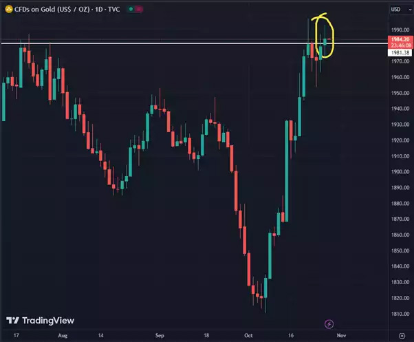
Gold Outperforming Stocks
As of today, gold is officially outperforming the S&P 500 in 2023. As of Thursday’s close, the S&P was up 7.8% since Jan. 1st, and gold was up 9.2% in the same period. This could be attributed to the bond news covered above, but it is also apparently weighted heavily by the Hamas attack and resulting war. In Aussie dollar terms, gold is up an incredible 17.2% this year whilst the ASX200 is down 2%, a 19% outperformance in gold over Aussie shares.
So, is the worst over for the economy and the war, or is it yet to come?
I hope you have enjoyed this week’s read, if you would like a confidential discussion around your investment journey, please do not hesitate to reach out.
Regards,
Head, Fixed Interest and Superannuation
JMP Securities
Level 1, Harbourside West, Stanley Esplanade
Port Moresby, Papua New Guinea
Mobile (PNG):+675 72319913
Mobile (Int): +61 414529814