February 1, 2021
Welcome
Welcome to our first JMP Report for 2021. We hope you had a great Christmas break and we look forward to working with you to create your wealth goals for 2021.
On the PNGX last week, the market saw BSP and CCP trade for the week. BSP saw 20,000 shares trade unchanged at K12.00 and CCP traded 20,010 shares at K1.70. Refer details below.
|
WEEKLY MARKET REPORT 25.01.21 -29.01.21 |
||||
|
STOCK |
QUANTITY |
CLOSING |
CHANGE |
% CHANGE |
|
BSP |
20,000 |
12.00 |
– |
|
|
KSL |
– |
3.25 |
– |
|
|
OSH |
– |
9.52 |
– |
|
|
KAM |
– |
0.90 |
– |
|
|
NCM |
– |
81.50 |
– |
|
|
CCP |
20,010 |
1.70 |
– |
|
|
CPL |
0.50 |
– |
||
In the interest rate market, there is very little change from what we signed off with in 2020.
TBills 273 days – 6.04% and 364 days – 7.20%
We are seeing some good volumes offered by BPNG.
Tap Bonds– 2yr-7.54%, 4yr-9.34% 8yr-10.72% 10yr-11.92%
The Bonds offers a semi-annual coupon so your actual rate of return is higher than the issue yield. Talk to our fixed interest specialist, Chris Hagan for more information.
What we have been reading
- 7 Key charts for investors to watch regarding the global economy and investment markets this year
By Dr Shane Oliver, Head of Investment Strategy and Economics and Chief Economist AMP Capital.
Introduction
Our high-level investment view is that while shares are vulnerable to a short term correction having run up hard since early November, overall investment returns will be solid this year on the back of economic recovery (driven by stimulus and the deployment of vaccines allowing a more sustained reopening) at the same time that interest rates remain low. And we are likely to see a further shift in relative returns to investments that benefit from recovery – resources, industrials, tourism stocks and financials. This note looks at seven charts we see as critical to the outlook.
Chart #1 – new coronavirus cases
The deployment of vaccines holds hope for a sustained global reopening and return to something more normal and our base case is that this will be successful over the next year or so. Key to watch will be the trend in new coronavirus cases and deaths.
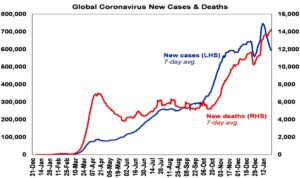
Source: ourworldindata.org, AMP Capital
Global new cases have slowed again lately but this appears to owe more to the latest round of lockdowns as only around 5% of developed countries’ populations and less in emerging countries have been vaccinated. Uncertainty remains around vaccine effectiveness in preventing infection and serious illness, their effectiveness against new mutations, how long protection lasts for, what portion of the population will need exposure or vaccination for herd immunity, etc. That said, there are some positive signs regarding vaccine efficacy beyond formal trials out of Israel where vaccination is above 30%.
Chart # 2 – global business conditions PMIs
Global Purchasing Managers Indexes (PMIs) – surveys of purchasing managers at businesses in most major countries – are an excellent and timely guide to the state of the global economy. Since the initial lockdown lows early last year they have rebounded sharply, albeit with the services sector still lagging given distancing restrictions and remain consistent with strong growth this year. They will ideally need to improve further to see our expectation for global growth of over 5% this year and to underpin a strong rebound in profits.
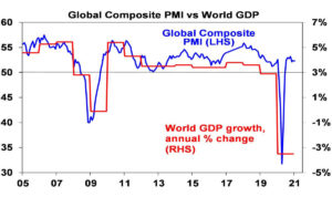
Source: Bloomberg, AMP Capital
Chart 3 – unemployment and underemployment
At present, investors face the ideal backdrop of improving growth but low interest rates. Key to watch in terms of the latter is spare capacity. One of the best measures of this is unemployment and underemployment
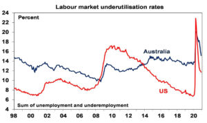
Source: Bloomberg, AMP Capital
The combination of unemployment and underemployment has fallen sharply from last year’s highs but remains relatively high in the US and Australia. A continuing sharp fall from here would bring forward the time when central banks move from easing to being primed for tightening. That said we have a long way to go to full employment as even pre-coronavirus levels did not generate much inflationary pressure.
Chart 4 – global inflation
This year has started with a bit of an inflation scare and US and Australian headline CPI inflation measures look like rising to around 3.5-4% over the year to the June quarter as last year’s June quarter price slump drops out of annual calculations and higher commodity prices feed through. Core and underlying inflation measures will remain the main focus of central banks and right now they are well below target in the US, Europe, Japan and China as is the RBA’s preferred measure of underlying inflation in Australia at 1.2% year on year.
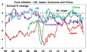
Source: Bloomberg, AMP Capital
Chart 5 – bond yields
Long term bond yields plunged in the initial stages of the pandemic on safe haven demand and then as central banks bought bonds to inject cash into their economies. Higher long bond yields and steeper yield curves (i.e. the gap between long term yields and short-term interest rates) are part and parcel of economic recovery as a result of less saving and more borrowing. If we don’t see higher bond yields it would raise concerns that risk taking and investment – or borrowing short and lending long – may not occur. That said, we don’t want bond yields to rise too far too fast lest they boost borrowing costs too quickly and so crimp the recovery and put pressure on share market valuations – as occurred in 1994. So far so good with bond yields up from last year’s lows (by around 0.5% in the US and Australia and less elsewhere) but not dramatically so. More upside in yields is likely this year but too rapid a rise – perhaps as investors who are loaded up on bonds seek to offload them – would be a concern.
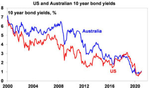
Source: NBER, Bloomberg, AMP Capital
Chart 6 – the gap between earnings and bond yields
The rebound in shares since March has pushed traditional valuations like price to earnings multiples to extremes leading some to fret about overvaluation and a bubble. But shares should trade on higher PEs and hence lower earnings yields when interest rates and bond yields fall. Once this is allowed for, share valuations are not extreme. One way to look at this is to compare the earnings yield on shares (i.e. the inverse of the PE) to the 10-year bond yield. Despite the rally in shares and recent rise in bond yields, it indicates that shares still provide a decent risk premium over bonds. This gap is worth watching – rising bond yields would make shares less attractive, but this can be offset by rising company profits where we expect to see strong gains this year.
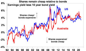
Source: Thomson Reuters, AMP Capital
Chart 7 – the US dollar
The US dollar is a counter cyclical currency so cyclical moves in it against a range of currencies are of global significance and bear close watching. Because of the relatively low exposure of the US economy to cyclical sectors like manufacturing and materials, the $US tends to be a “risk-of” currency, i.e. it goes up when there are worries about global growth and down when the outlook brightens. And a lot of global debt is denominated in US dollars particularly in emerging countries, so when the $US goes up it makes it tough for emerging countries. If we are right though and the global economy continues to recover, then the $US is likely to decline further (i.e. the red line in the next chart will fall further) which would be positive for emerging countries. It would also mean more upside for the $A against the $US (i.e. the blue line will continue to trend up) – the big movements in which are primarily a $US story.
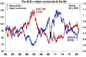
Source: Bloomberg, AMP Capital
Concluding comments
Share markets have had a strong rebound from their March lows. For further solid gains, beyond inevitable short term setbacks, the indicators shown in these charts need to remain favourable or move in the right direction so they are worth keeping an eye on.
- Norway’s trillion-dollar wealth fund sold the last of its investments in fossil fuel companies
Norway’s decision was an economic one, but it’s still a step in the right direction on climate change.
- Share this on Facebook (opens in new window)
- Share this on Twitter (opens in new window)
- SHAREAll sharing options
Norway’s trillion-dollar sovereign wealth fund has sold the last of its portfolio of oil and gas companies in a major step away from the country’s reliance on its petroleum industry.
Trond Grande, deputy CEO of the fund, made the announcement of the final sale, which occurred at the end of last year, in a phone call on Thursday.
The decision to nix the fund’s portfolio of oil and gas companies, worth $6 billion, was an economic one. In 2020, the fund reported losses of $10 billion in oil and gas shares that were worth $40 billion at the start of the year. Back in 2017, the central bank of Norway said the government should drop oil and gas investments to protect the wealth fund — the world’s largest — from the price volatility.
It looks as though it is finally acting on that advice. (The fund had a decent year overall, earning more than $120 million despite the economic fallout from the coronavirus pandemic.)
Norway’s sovereign wealth fund was created in 1990 to keep the economic benefits of its lucrative oil and gas industry within the country. The fund gains revenue from taxes on Norway’s petroleum industry and from selling leases to private companies looking to extract more oil from its waters.
With shares in more than 9,000 companies spanning 74 countries worth an estimated 1.5 percent of total global investments, the wealth fund may be, as US environmentalist Bill McKibben tweeted, “earth’s single biggest pool of investment capital.”
Norway wants to be an international leader on climate change, yet it continues to rely on heavily polluting fossil fuel extraction for continued economic prosperity, a contradiction often referred to as Norway’s climate change paradox.
The fact that the fund has pulled out of oil and gas companies is a big step in the right direction. But there’s still a long way to go. That’s because Norway isn’t cutting all ties with its petroleum industry just yet. Not even close.
On January 19, Norway granted 61 licenses for offshore oil exploration to 30 companies. Norwegian Minister of Petroleum and Energy Tina Bru said in an announcement that it is “good news for the Norwegian state as a resource owner.”
As Bård Lahn, a researcher at Norway’s Centre for International Climate Research (CICERO) in Oslo, told me earlier this month, economic concerns are likely to be the most influential factor pushing Norway away from future oil and gas production.
And, sure enough, it appears that rather than addressing environmental concerns, the wealth fund’s decision to sell its portfolio of oil and gas companies was about protecting profits.
- Hydrogen Key To Clean Long-Haul Transport in Canada
A national strategy launched in December presents the chance for the country to lead on clean hydrogen technology
Long haul transportation, core to shipping people and goods across Canada’s vast geography, remains an obstacle to the country embracing clean energy.
Between 1990 and 2018, Canada’s transport emissions grew 55%, much of that coming from trucks — both freight and light passenger models. With the long-awaited launch on December 16 of a national hydrogen strategy, the federal government signalled that hydrogen will be part of its long-haul solution. The strategy aims to position the country as a global leader in the production, export and use of clean hydrogen and associated technologies. To support those goals, the government has invested $1.5 billion in a fund to support low-carbon fuels, including hydrogen.
Hydrogen fuel-cell vehicles are fast to fuel up, have longer mileage ranges than electric vehicles, and emit only pure water. But they require a network of refuelling stations (unlike EVs, which can be charged in an owner’s driveway). Also, they’re far more scarce than EVs — offering few options to consumers.
Sourcing the hydrogen further complicates the national plan. Most hydrogen currently is produced using fossil fuel. As technology improves, electrolysers powered by renewable energy will help boost production. In an ideal scenario, geothermal energy in Alberta, wind or sun in the prairies, or hydroelectric power in Ontario or Quebec would be captured in hydrogen and shipped (via a pipeline even) wherever it’s needed. With enough infrastructure to support such a system, hydrogen potentially could be used to heat homes, or power industry.
“In a province like Ontario, where frequently we’re actually paying the Americans overnight to take electricity off the grid, you could be creating hydrogen and that hydrogen could be firing our burners,” said Stephen Beatty, vice president and corporate secretary of Toyota Canada Inc. In time, Beatty believes hydrogen — which is core to Toyota’s global strategy — could be a viable economic sector for Canada, as well as a pillar of clean transportation.
One more positive development: In December, public utility Hydro-Quebec announced plans to construct one of the world’s most powerful electrolysers to produce green hydrogen.
JMP featured in Business Advantage PNG – full article click here.
Have a great week and please feel free to contact our team for further information.
Regards
Chris Hagan
Head, Fixed Interest and Superannuation
JMP Securities